Good morning, good afternoon or good evening to you, for wherever you’are and at what time you read this article.
In this article I will try to cover the Root Cause analysis(RCA) for almost any kind of processes or equipment that falls under the process or manufacturing industry using a methodical way of analysis. Briefly speaking, the kind of analytics that is widely considered in process industry falls under the following categories, as below,
- Monitoring or Prognostic,
- Descriptive,
- Prescriptive,
- Diagnostics,
- Predictive
In-order to stick to the topic of discussion we will restrict ourselves to the diagnostic kind of analytics, where you get to see the space for RCA. This kind of analytics is mostly considering or is mostly the function of the volume of historical data that you have collected, it’s sampling frequency rate, the amount of variability or the interactions that should be necessary and sufficient enough to estimate the state of your system. Here, the former point speaks about the volume of data, which is pretty much subjective to the analytical case-study that you’re trying to cover. (For some use cases 1 year data is sufficient, and for some even 3–5 yrs data is scant)
I hope this gives you a brief idea about the difficulties involved in process historical data aggregation and other process data engineering phases.
Here, we will showcase on how to use Principal Components Analysis (PCA) for performing RCA. PCA is a unsupervised machine learning algorithm, that assumes the linear correlation among your feature matrix, and transforms them to a reduced dimensional space.
Note: Since PCA does not considers the labelled values for analysis(Transformation and dimension reduction), it would not be a good practice to use this model directly for prediction without having the check on the correlation of your transformed, reduced input features and your labelled features. It is possible that PCA could have eliminated some important input features that shows high correlation with your labelled outputs.
Following would be a guided roadmap to perform RCA using PCA:
Please note that in this article we will cover only the application of the models for RCA and not on what’s and why’s behind the algorithm.
- Gather the dataset that you want to include for analysis (This article assumes that data engineering and cleaning is done),
- Apply PCA on the dataset using the pre-cooked PCA model available in scikit learn package in python,

3. Get the information about the captured variance, feature importance or eigen values corresponding to the principal components.

The output of the above code should be like,
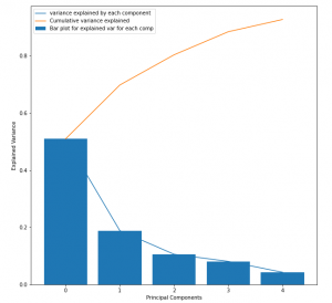
This should be helpful for estimating the number of principal components to consider for RCA over the process dataset. This plot is also known as the scree plot, where the blue curve could be imagined as an elbow, and the joint(point on the curve where maximum slope change occurs) represents the number of principal components to consider.
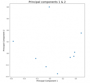
4. Plot the top 2 principal components, in-order to get the estimation of the correlation between the transformed features. This will be important because PCA performs the orthogonal transformation of the features by capturing maximum variability of the input space, which speaks a lot about the state of the system. The points in the plot represents the dependency or relationship of the input features with the PC1 & PC2 respectively. This will give you the quantified idea about which principal component captures the variability of which all input features and how much. This will be very important step for evaluating the performance of the model. At this stage the user should leverage the flexibility of the PCA and identify whether your model is able to capture the linear variabilities or not,
This enables the user to make decision with 3 degrees of freedom, as follows,
- If sufficient variability is captured by Principal components 1 & 2, then continue
- If the amount of variability captured is not sufficient then increase the number of principal component to capture the sufficient information about the process,
- If both of the above steps fail, then it is the indication that linear representation of your dataset is not a good option as it performs very poorly. Go back to the model selection step and choose a non-linear model for better performance, which means to say, drop PCA.

4. Congrats!!! if you are on this step, then it means that PCA has a performed well for your dataset. Let’s leap a step further, where we will be addressing and identifying the abnormalities, anomalies and outliers in the process.
T-score plot
Score plots using PCA can very well address the issue of unusual behavior in the process or system that could result in failure of operations, equipment, deviation from the ideal quality of products in the output. Below is the snap of the t-score plot,
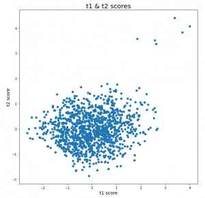
Score plot is calculated by taking the element-wise multiplication of your X(input feature space) dataset and the transpose of your principal components matrix.
t-score-matrix= X * (PC-matrix).transpose
The interpretation from this plot are as follows,
- The cloud or cluster of points represents the usual or normal behavior, where the points lies very close to each other. Whereas the points for which the mahalanobis distance is significantly more than the others, speaks about the abnormality in the behavior.
- In the above figure, it’s conspicuous that 6 points in the top right are lying at a significant far distance from the others. This could be a sign of the abnormality, which could be an outcome of deviations introduced in the process parameters or the material properties itself.
Hotelling’s T2 plot
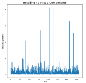
Hotelling’s is the extension of the student t-test. This metric is calculated as follows,
T2=t-score-matrix[:,i]/explained-variance-ratio[i], for ith transformed feature.
If we have considered the 2 principal components, then the above metric will be evaluated corresponding to those 2 components(i={1,2}) and then the resulting vectors will be added to get the final metric array which will contain it’s element in the order of time.
The peaks seen in the plot are the indication of the time, at which the un-clustered points observed in the t-score plot occurred. Here, the height of the peaks says about the intensity of the deviations, which makes it a requirement to focus first at the point in time where the highest peak was observed and so on. Also, the investigation process for the largest peak should be easier than the rest because it shows a larger deviation, to which one would expect that the deviations in the operational parameters or process parameters could be easily identified.
Conclusion and take-away
The key idea to take from here is to visually look into the trends of those process parameters that are highly correlated with the Principal components 1 & 2. If deviations or unusual behavior than normal is seen the trends, then that should be the indication to understand why this happened, or in simple words, what made the process to be operated at that unusual conditions. And if, the process parameters looks fine at the first place, then this investigation for RCA is pointing at material properties, which is the function of the vendor, quality of raw material, age of the raw material and so on.
ways to perform RCA:
- Looks into the t-score plot if there are any outlier points (points lying away from the cluster), if yes then follow the second step, and if no then it concludes that the data-driven approach was not able to capture those unwanted behavior that happened in reality
- Hotelling’s metric can give you the idea about the time point at which those deviation or unusual behavior was observed by looking into the peaks.
This makes the task pretty much easier to diagnose the process, with the help of captured understanding of the Analytics and domain.
The main drawback of this could be that Data scientists or the analysts who are involved in this task also requires the understanding of the domain, which can make his/her task easier to understand the process data.
I hope that this approach will prove to be a powerful key to a many process/manufacturing industries who are looking for process improvement by performing the historical data analysis. Understanding the behavior of the process in this way will give then the flexibility and wisdom to enable themselves to look for a better way of operations and a better insights about the process itself.
Volume of data could be a challenge for many industry but nonetheless if taken this approach, then it should empower them with a quick crude insights about historical behavior of the process. As a recommendation, one could start even with a small volume of data (1 or 2 months), and see how this model or approach works, as the required volume of data is purely a function of the process. A first level of investigation with the initial volume of dataset should give you the idea about how much the ML/AI model is able to understand your process. And in reflection, if the model doesn’t capture much of your process variability or information in the principal components, then you should try to gather more data until the saturation is observed in the information stored by the model.
Let me know your thoughts on this approach, if this idea helps you to improve the performance of your process.
Thanks for spending time in reading this article.
Written by:
Parth Sinha
Sr. Data Scientist at Tridiagonal Solutions
